U-Save F & B Equipment P/L Equipment Supplier Singapore
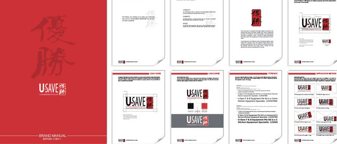
reviewing a 22-year corporate identity design
The client is a successful and reknowned company in the industry. Due to competition and their emphasis on branding and digital marketing, the client needed a contemporary corporate identity and online presence. We developed the new logo in 2008 with a strong emphasis on the company’s values and belief system. This influenced the decision to include Chinese words that represent the traditional values and principles of the company.
the content
Depending on the client’s business model and strategie (B2B), we propose a Logo Guide instead of a full-fledged Brand Manual. For the purpose of internal branding, a simplified version of the brand blueprint is included in this project.
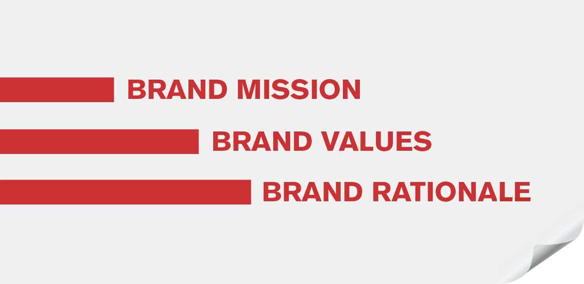
logo definitions
Definitions such as the ratio aspect and clear space, or breathing space helps to enforce and protect the integrity and value of the Corporate Identity wherever it is applied.
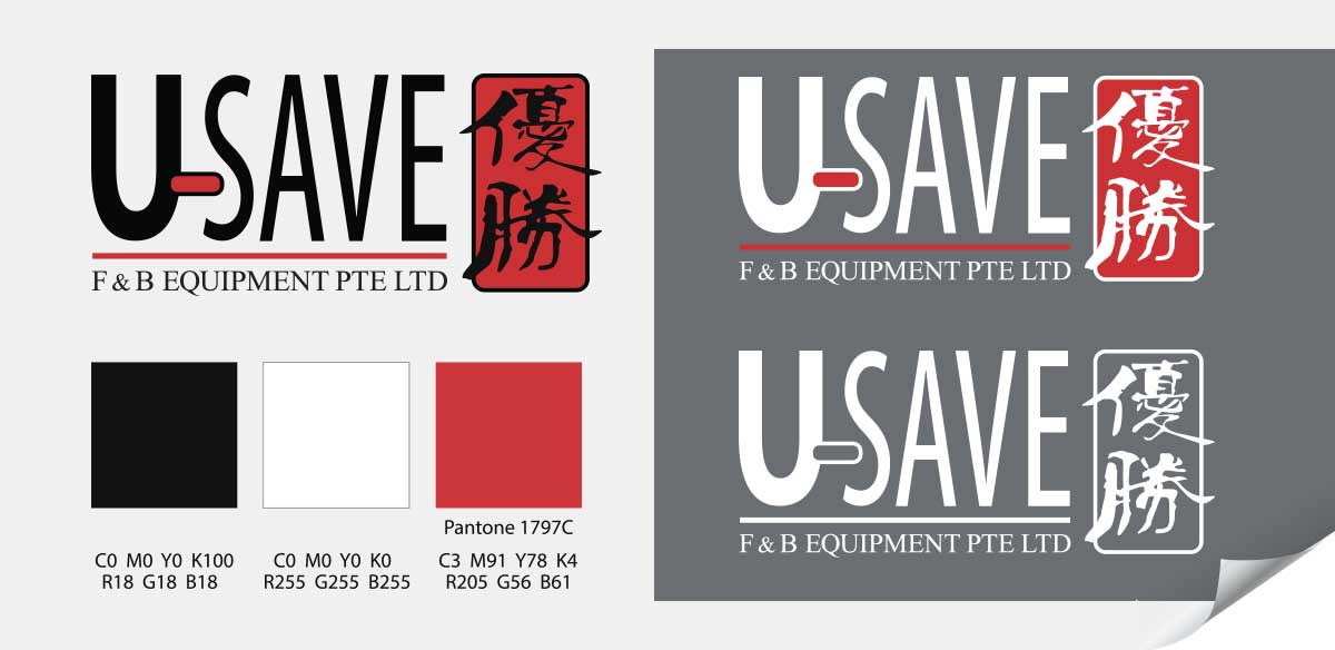
colours
Defining the colours of the Corporate Identity ensures consistency in application and also help to enforce the integrity and value of the Corporate Identity where it is applied.
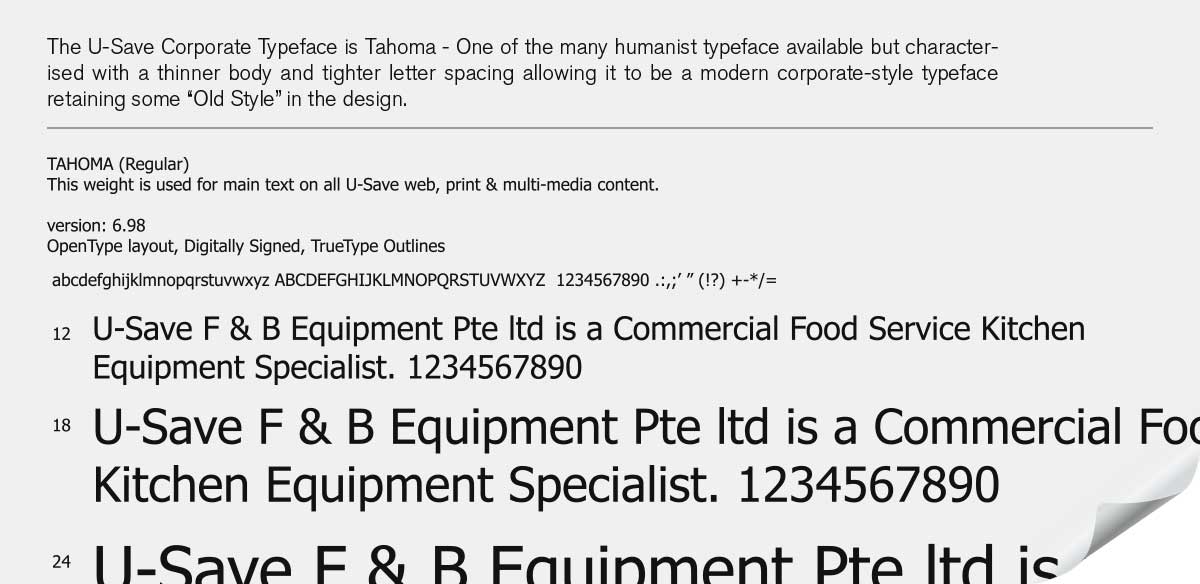
typeface
Defining the typeface ensures a consistent communications tone and style that reflects the identity of the brand. Consistency and enforcement builds brand value.
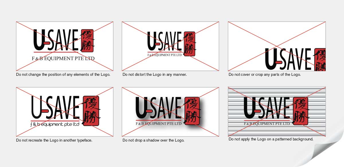
applications guide
Providing a guide on wrongful and approved application of the Corporate Identity not only ensures consistency in communications, but also signifies the company’s emphasis on protecting its brand assets and value.
Client: Industry: Location:
U-Save F & B Equipment P/L Equipment Supplier Singapore