Plantations is a brand of Spa Esprit Group (SEG), a strong advocate of the social enterprise and urban farming movement. With the help of professional urban farmers, there are currently 6 urban properties under SEG’s belt growing herbs and plants for use in products and treatments across their F & B and beauty brands. We were engaged to conceptualize and design the product label for a series of products from Plantation.
Conceptualization - One
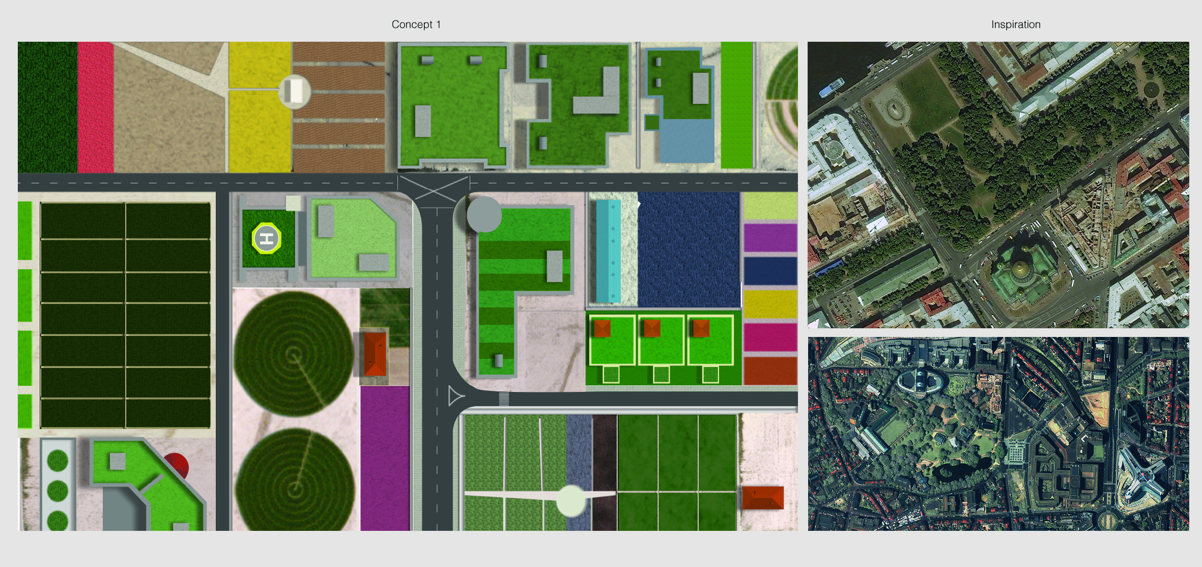
Urban Farming. We thought of the rooftop garden that the client have invested in. We like the idea that the view from above returns to plots and plots of green, instead of dull, grey tiles, air-con compressors, water tanks etc.
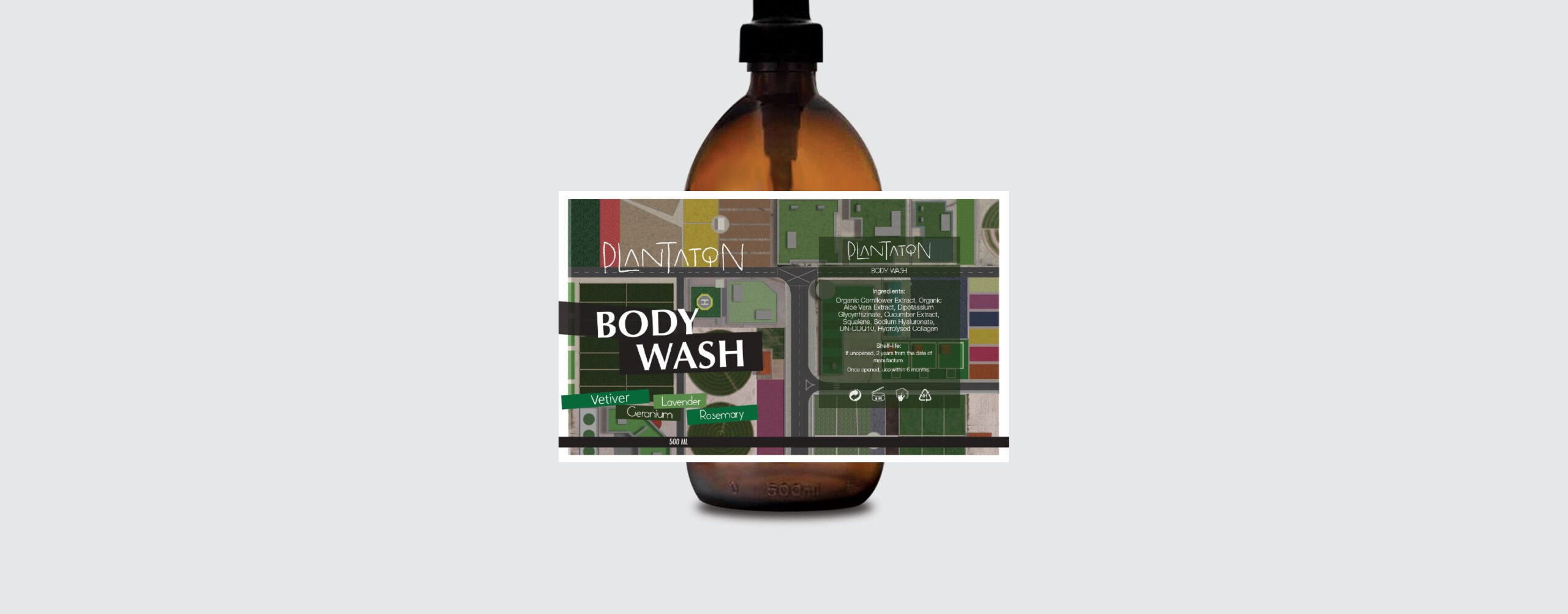
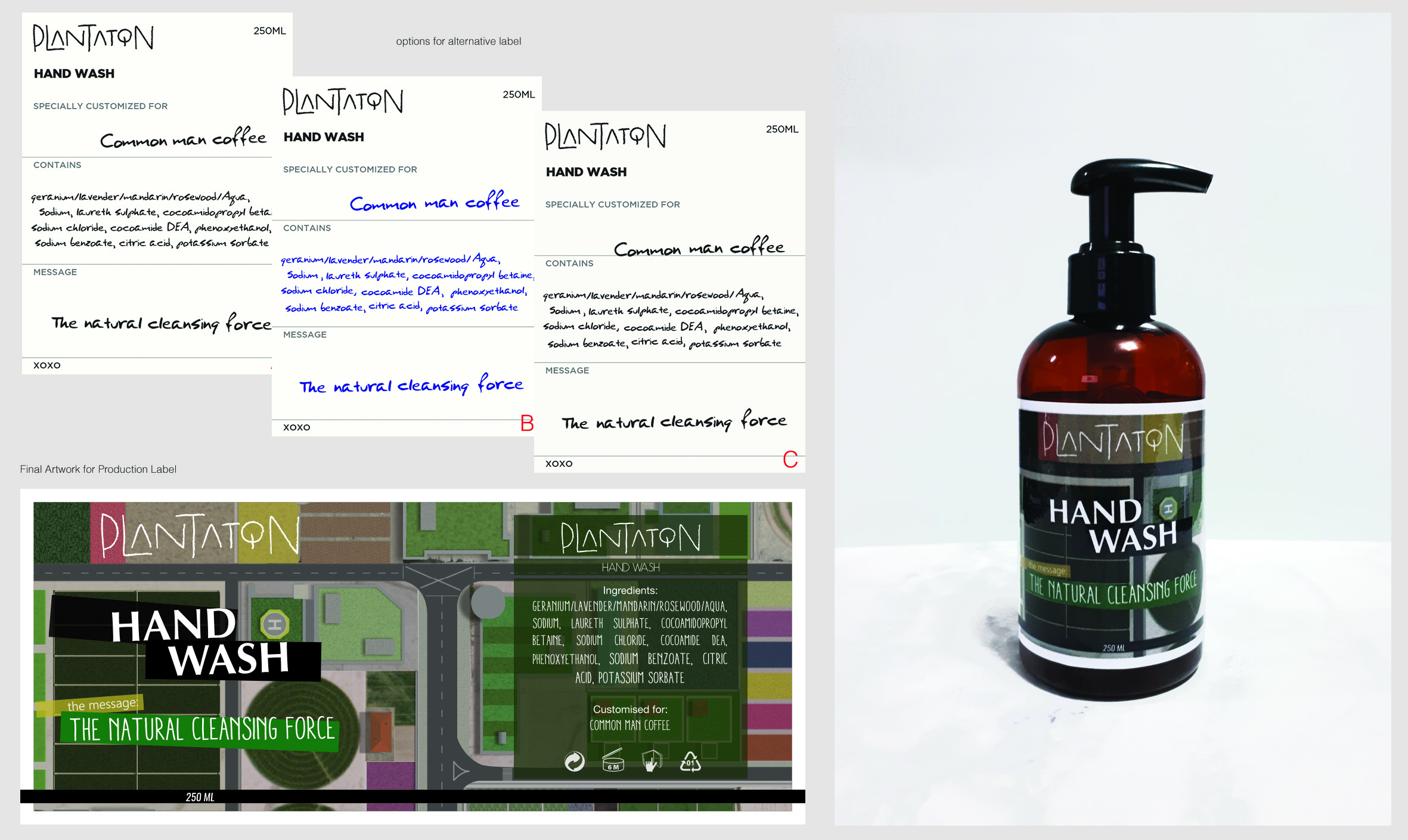
Concept 1 is a bird’s eye view of a modern city with rooftop gardens and vegetable farms on every building. Cel shading style defines the art direction, creating a surreal, game-like visual. This concept captures the vision of the client in a unique, atypical visual presentation.
Conceptualization - Two
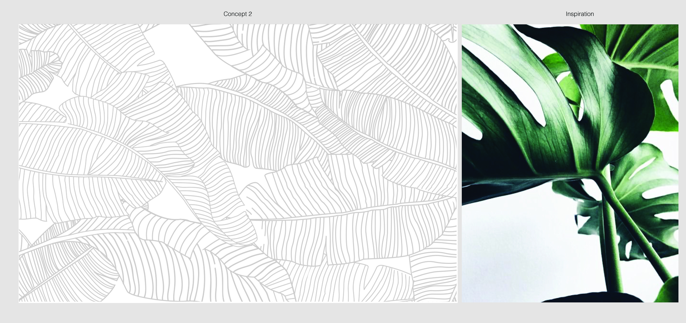
Taking the brand name literally, we presented concept 2 with plants – outlined. The leafs are positioned to obscure what’s behind, connoting the type of product in concern here, one that’s used in complete privacy.
Concept is further developed to provide the client more clarity. This concept emphasize leveraging contrasting duo-tone visual effect. Spaces that are not part of the leafs are hollowed to reveal the colour of the bottle, further highlighting the feel of obscurity.
We proposed that products of the same series should share the same concept & art directions with minimal, but obvious differentiating visual elements for each different products. In this example, yellow is used to represent Hair Wash.